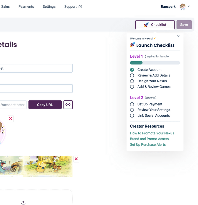
Onboarding checklist

What is it?
Working alongside product, we wanted to help creators be as successful as possible when launching their stores. We discussed and iterated on what actions were the most significant factors in a successful store and which ones were most important that they should be required. We went back on forth on the best behavior and layout for the checklist, whether it should propagate between pages, be opened automatically on page load, and so on. We landed on staying on every page in the dashboard and being integrated into the same bar to have it be in a consistent and fixed position across pages. The list is also automatically opened on the desktop to ensure the creator sees what they need to do whenever they navigate to a page, at least until they've completed the initial required steps. On mobile, a pulsing animation plays to draw attention to the button without covering all the page contents on page load. Once the list has been opened, the pulsing animation stops as not to distract or annoy the user. There was a big emphasis on collaboration for this project. My input directly led to the decisions we reached and greatly improved the overall user experience to decrease the likelihood of creators bouncing on the product before completing onboarding. The list carrying between pages, mobile behavior, tooltip descriptions, and optional actions being split into a different category resulted from my suggestions and feedback. I also worked closely with the backend developer to best implement the data model for what items had been completed and how to represent that data.
